Technology architects: be wary of spaghetti and sceptical of lasagne

Photo credit: Mateusz Feliksik on Unsplash
There’s an old joke that technology architects spend their time turning spaghetti into lasagne. Whenever we inherit an existing architecture, we map the systems, draw the interactions between them, and immediately declare it to be a big ball of spaghetti: a chaotic mess of connections which it is impossible to make sense of. We then draw a lasagne diagram, in which everything is neatly organised into layers. Here are our front-ends, here are our back-ends, here is our orchestration layer, and so on. Now, can we please have lots of money to convert one type of pasta dish into the other?
I must admit that I have built many business cases, presentations and documents which promise to turn spaghetti into lasagne. Sometimes, I have even used the tactic of representing the current state using a physical diagram of interfaces and connections: a picture that, in any architecture of even moderate complexity, rapidly becomes illegible. Why would anybody choose to stay in that start, when we could build the neatly layered target state shown on the next slide?
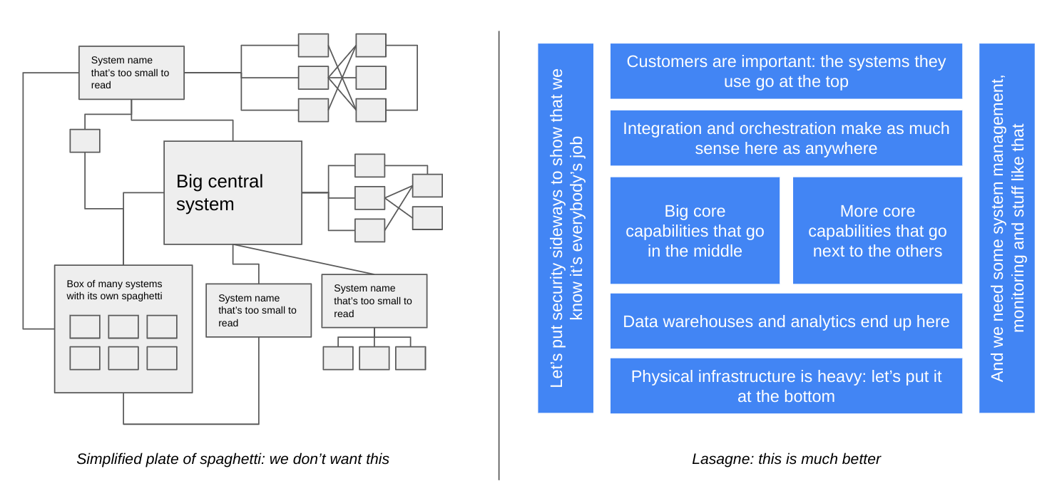
Figure 1: picture I have sometimes drawn. I bet you have too.
Over time, I have become less and less comfortable with the lasagne diagram. There is no doubt that it can be a useful way to organise our architecture conceptually: if I have a big mass of stuff (let’s say, a few thousand applications and a few tens of thousands of infrastructure components) then I need to organise them in some way in order to make sense of them. And organising them in layers makes intuitive sense. I start by putting all my externally facing systems at the top of the diagram, and all of the infrastructure at the bottom of the diagram. Then it’s natural to fill in the space in between with groups of systems which perform similar functions. I have drawn pictures like this many times in my career, and they have helped me to solve problems, make plans and design solutions.
However, every time I have drawn such a picture, I have been conscious that it is not strictly accurate. Sometimes the interactions with the outside world skip this externally facing layer and come straight to the internal systems. Often, this big system in the middle doesn’t fit naturally into any of the layers. And every time I put analytics systems near the bottom I struggle to think of a way to represent their interaction with all of the other layers. Perhaps we could take the extravagant step of turning one of the boxes sideways? Maybe that will carry some meaning.
I don’t think we should stop using lasagne pictures altogether. They are useful tools for communicating between groups with different levels of technical experience and understanding, and such tools will always be full of compromise.
I do think, though, that we should be alert to the consequences that the lasagne picture has for the real world. Just as every piece of code we write may live on much longer than we ever expected, every document we write and every picture we draw will have an impact on people’s understanding and behaviour. If they don’t have that impact, why bother writing and drawing them at all? Perhaps we should invent a version of Conway’s law in which our architectures not only resemble the way we organise our people, but also the way in which we organise our concepts.
And some of these consequences are counter-productive. For example, when I have drawn my own lasagne pictures, I have sometimes included orchestration layers, API layers and security layers. At first sight, this seems reasonable: I need to orchestrate business logic, I need APIs to access the functions and data in my systems, and I definitely need security. But do I need them all to be layers? Wouldn’t it be better if all of my applications had well-defined APIs, if they were all designed and built securely, and if business logic resided in, well, business applications? Possibly, but as soon as I select the rectangle shape in my presentation or modelling application, and drag it into that wide, thin shape, I encourage myself and others to think of these layers as discrete, externalised capabilities. And it’s only a short step from drawing that simple rectangle to selecting products, planning projects and organising teams, and the concept is crystallised in my architecture.
Despite these counter-productive consequences, I’m not going to offer a new approach to expressing technology architectures, for three reasons. First, because I think that the world doesn’t need yet another approach to modelling technology architectures, and, second, because I am sure that new method would have its own problems: every model or diagram is an imperfect representation of the reality we want to create, and those imperfections have a habit of becoming part of the reality we have to live with.
And, third, I don’t think that the answer is to create different modes of representation. The lasagne diagram persists because it is a useful communication tool: it creates a common ground for people of different backgrounds to have meaningful discussions. However, I do think that technology architects have a responsibility to understand the implications and limitations of the ways we express our architecture: we must not mistake the map for the territory, and we must not imagine that by organising our components into neat layers of sauce and pasta, we make the world neater - or even that we should do.
